Reporting
Good Data In, Good Data Out
The 4 Types of Reporting in Primavera
Layouts/Views
Layouts and Views can be used as a form of reporting. They can also be used for streamlining work done in the software. If you need help building useful layouts and views reach out!
P6 Pro Reports
Primavera P6 Professional has the ability to build reports. These reports may not be graphical, but they are simple to build and to run. We’ll teach you the ins and outs of building these reports to get the information you need.
Dashboards
Primavera P6 Web utilizes dashboards as one of it’s forms of reporting. This type of reporting can be somewhat interactive. Providing the user the ability to drill-down into more detailed information from a summary.
BI Publisher Reports
BI Publisher reports are accessible in P6 Web for manual execution, but they can also be automated to send to a group of people through email. They are the best type of reporting because they can cover all levels of the P6 database in one report. They also can be built with excellent graphics.
BI Publisher Report Portfolio
Take a look at our BI Publisher report portfolio. If there’s a report that really resonates with your team then let us know. It can be a good starting place to get the exact type of information you were looking for to keep your organization well informed on all aspects of data in the project schedules.
One interesting thing you may notice is that some of these reports have gantt charts and look very similar to something in P6. However, all of these reports are built in BI Publisher which means you can automate when they get printed and sent out.
You can also set them up as a bursting report. With a bursting report it will send the report as an attachment to individuals only if certain criteria is met. Each time the report is run the list of individuals that get the report could be different depending on the data. For instance if different people were responsible for different activities. Then we could create a bursting report that would only notify the individuals with activities that were behind schedule.
If you like any of the reports in the tabs below click on the button to engage our team to build and customize it for your organization.
Project Summary for a Turnaround
This Project Summary report was created for a turnaround project at a refinery. The report shows the current status of the project vs the baseline PLUS it has an S‐Curve by day that compares the current project to 2 baselines. In addition, the report shows Priority Jobs (which are WBS’s) and status for each subcontractor.
Project Portfolio Quality and Performance Report
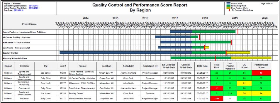
The Project Portfolio Quality and Performance report was created for a construction company to provide a quick overview of the projects for a specific region. In addition, the report used 12 metrics to calculate a schedule quality score and a schedule performance score.
A detailed Project Quality and Performance report was also created so that the project managers and schedulers could identify items that were negatively affecting their project and scores
Milestone Report
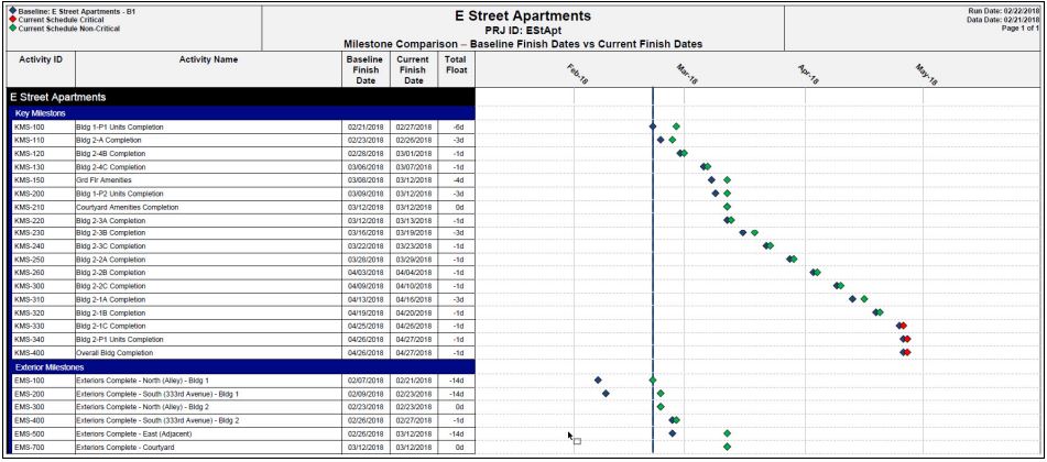
The Milestone report was created for a construction company to quickly compare baseline milestone dates with current milestone dates. The separation between blue diamonds and green diamonds clearly identify issues with milestones – the larger the separation, the bigger the issue.
In addition, critical milestones (the red diamonds) are easy to identify.
Key Deliverables Report
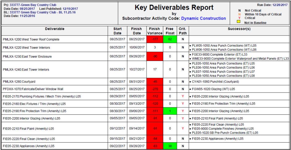
The Key Deliverables report was created for a construction company. The report was developed so that a project
manager can quick identify issues with key deliverables for a specific area (based on activity codes). In this example, the
list has the key deliverables for a specific subcontractor.
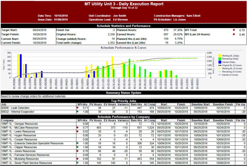
Project Execution
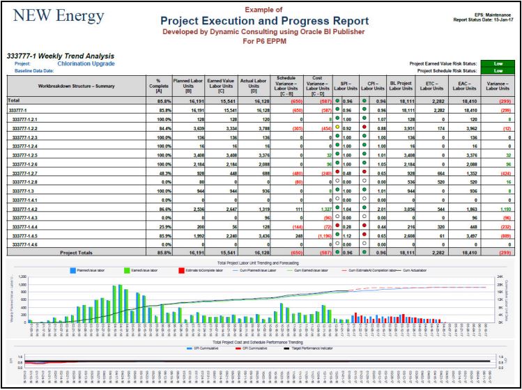
The “Project Execution and Progress Report” was developed for an electric utility company.
The table provides detailed information on specific WBS’s. The combined S‐Curve and Bar chart show planned labor units, earned value, and estimate‐to‐completion throughout the project.
Schedule Compliance
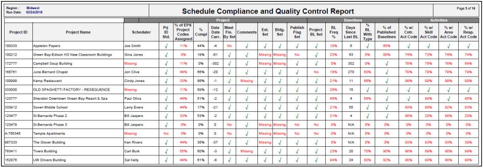
The “Schedule Compliance and Quality Control Report” was created to identify coding and project management issues. For example, each project manager was encouraged to create a weekly baseline, assign 9 EPS projects codes to every project, set a “Must Finish By Date”, and assign five (5) key activity codes to each activity (plus other requirements).
This report identifies compliance/noncompliance with those requirements.
Line of Balance
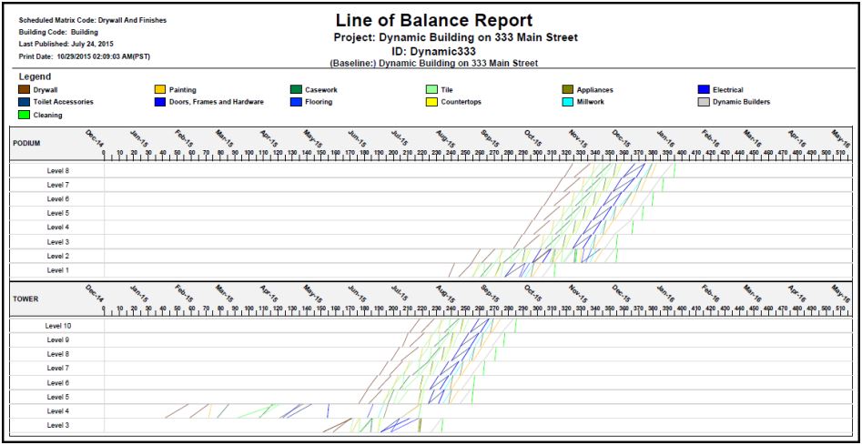
The LOB report was created for a construction company to identify problems in the schedule. Each line represents an activity (and its start and finish dates). The line’s color identifies the type of activity (Drywall, Painting, etc.). Using this report, the project managers (PM) can quickly see that activities on Level 4 of the Tower are not correct. Also – the PM can see there is a delay for Drywall on the Podium from Level 2 to Level 3. In addition, if activities cross, this may indicate a conflict in the schedule.
Activity Adherence
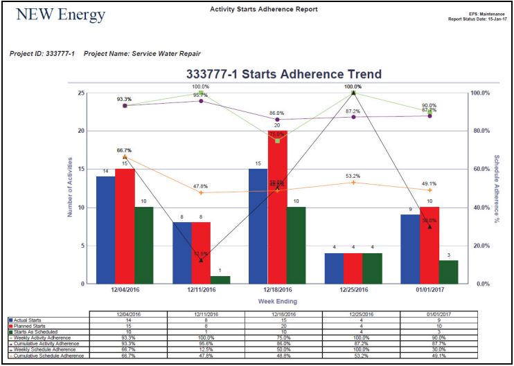
The “Activity Starts Adherence Report” was developed for an electric utility company. This report uses project snapshots over the past 5 weeks to compare Activity Starts from week‐to‐week. For example, in the week of December 4th, 15 activities were scheduled to start. HOWEVER – only 14 activities started (but some of the 14 activities may have been scheduled to start in a different week). Only 10 activities of the original 15 activities actually started.
Schedule Update for EPS
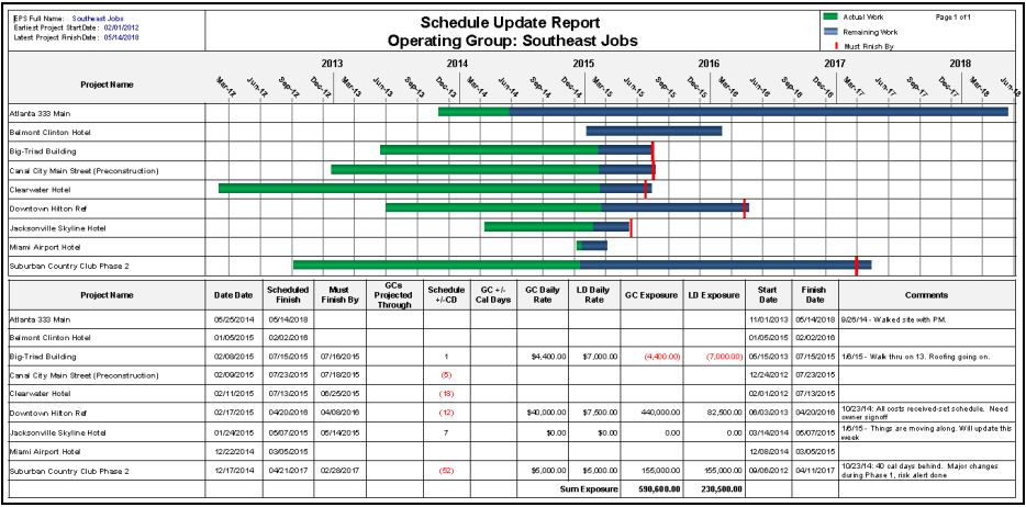
This report was developed for a construction company to provide a high‐level view of all projects under an EPS . The report graphically provides a quick status of each project and identities projects that will be late. The metrics table at the bottom of the report provides more details and KPI’s for each project.
Project Overview with S-Curve
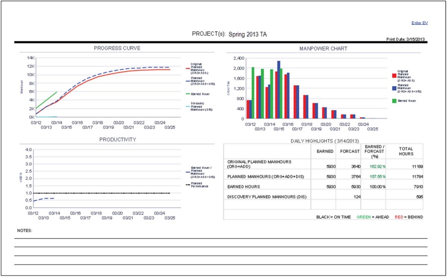
This report was developed for a refinery to provide a quick overview of turnaround projects.
Monthly Cash Flow
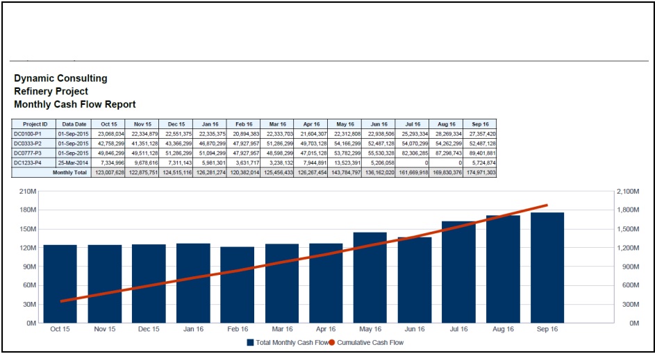
This report was developed for a refinery. The report allows the user to review the cash flow for any projects or group of projects (for any timeframe).
Project Status by Area
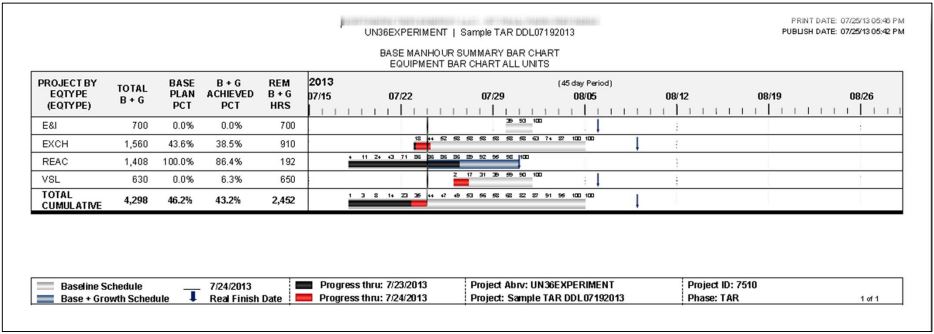
This report was developed for a refinery to quickly identify which components of an area (in this example the area is equipment types) are on schedule, behind schedule and ahead of schedule. Progress bars (the black and red bars) that terminate to the left of the vertical bar are behind schedule and progress bars that continue to the right of the vertical bar are ahead of schedule. The large grey bars identify baseline interval and new scope is shown with a larger dark blue bar. Percentages across the top of each bar shows “expected % complete” for each day. This report was also used to show progress and issues in other areas such as contractors and full units.
S-Curve
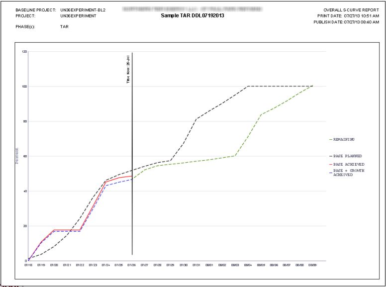
This report was developed for a refinery to track progress and remaining work on turnaround projects. This report was designed to include all activities for a specific activity code value or all values. The report also shows the baseline compared to the current plan (the current plan includes scope/growth).
Daily Numbers for S-Curve
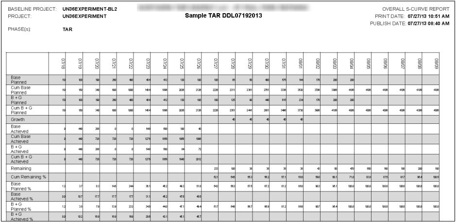
This report is the second part of the S‐Curve from the previous tab. This table shows the details for each day of the turnaround project. Most important values are shown as actual labor units and percentages
Project Schedule Gantt Chart
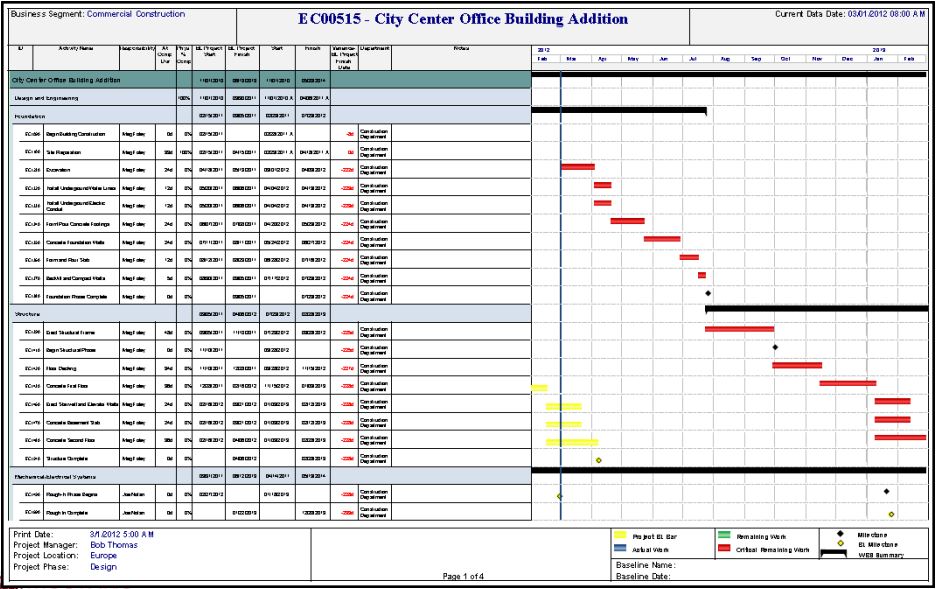
This report was originally developed for a utility to provide a visual view of the project similar to the view in P6 (however
this view was customized to the utility’s report specification). In addition, this report was designed to automatically send
the report to project managers on a weekly basis. This report could be useful to project managers in any industry.
Schedule Matrix
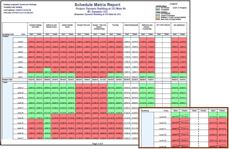
This report was developed for a construction company. Each start and finish date represents one activity for a task for a specific level. The color coding identifies the status of each activity (white/on time, green/ahead of schedule, and red/behind schedule). In addition, cross lines (see inset) identify activities that are complete (with a cross bar), started (with a single diagonal line), and not started (no lines)
Project Costs
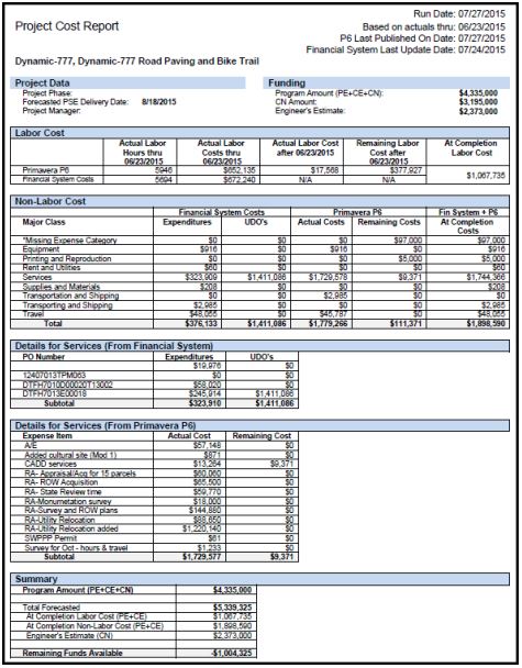
This report was developed for a federal government agency. This report combined data from P6 and the agency’s costing system. The report provides a detailed list of material and labor costs for a specific project from both P6 and the costing system. A summary of the project costs is shown a the bottom of the report.
Tier 1 Summary
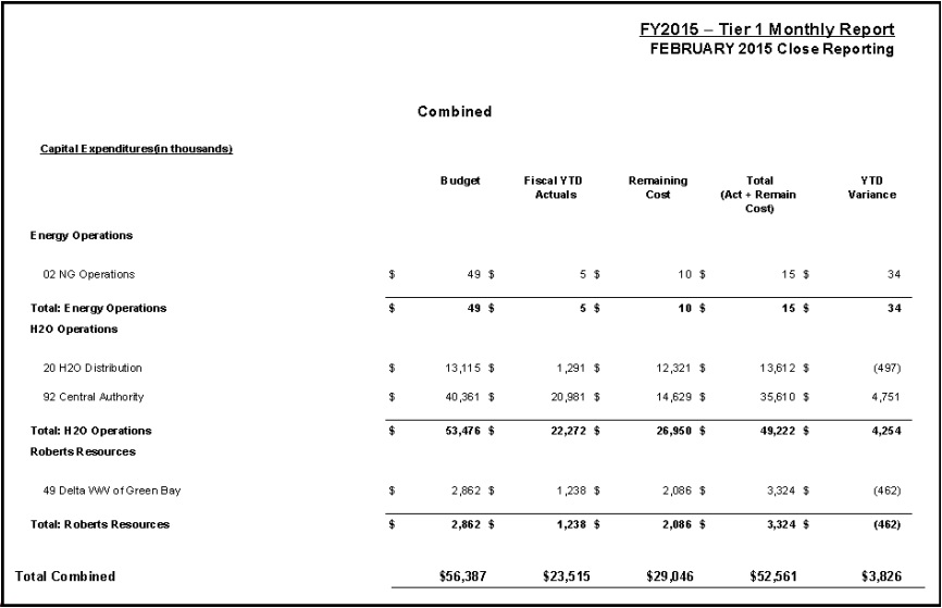
This report was developed for a natural gas utility. This report provided a summary at the operations level. This report combined data from P6 (such as remaining costs) and the utility’s financial system (such as actual costs to date)
Tier 3 Summary
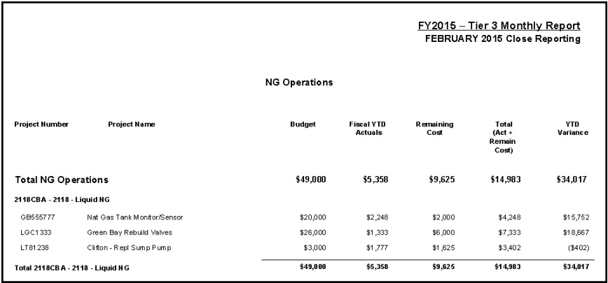
This report was developed for a natural gas utility. This report provided a detailed summary at a project level. This report
combined data from P6 (such as remaining costs) and the utility’s financial system (such as actual costs to date).
Timesheet Report
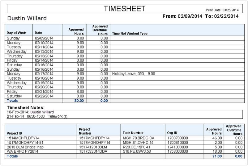
This report was developed for a federal government agency. The timesheet report provides a detailed list of hours by day in the top section of the report and a detailed list of hours by project in the bottom section of the report.
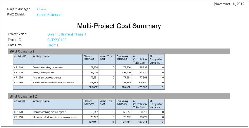
Multi-Project Cost Summary
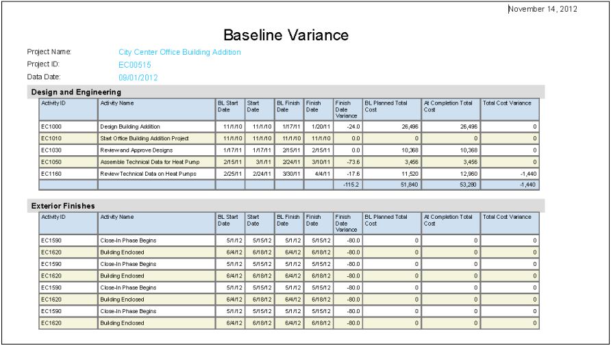
Baseline Variance
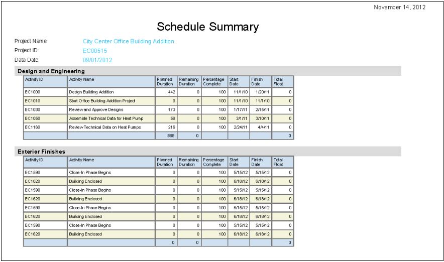
Schedule Summary